Project Summary
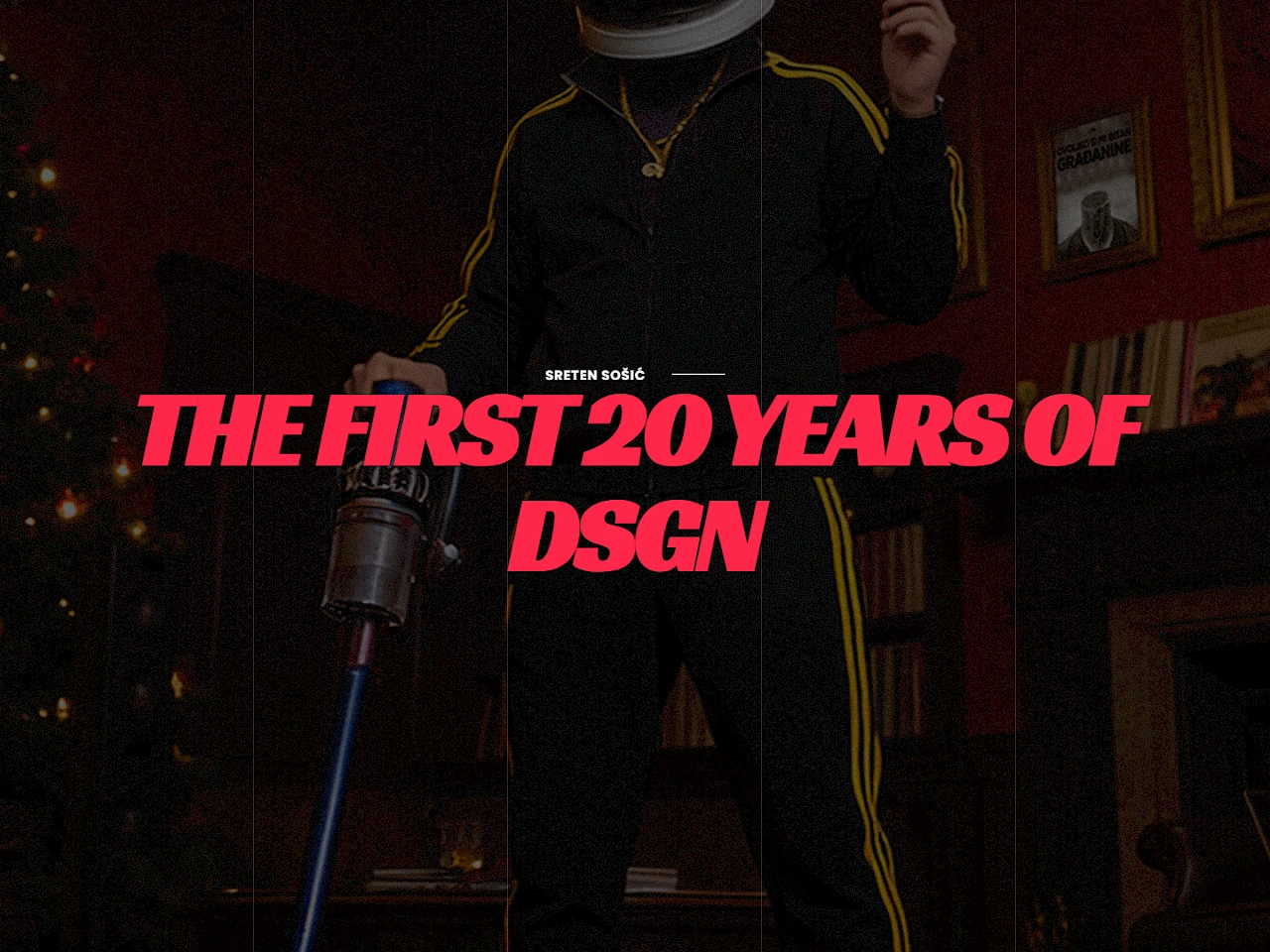
The public version of Sreten Sošić's portfolio uses a visual-first, cinematic presentation instead of a standard grid of projects. Bold typography, fullscreen imagery, testimonial copy, and selected work titles create an experience that feels closer to editorial storytelling than to a conventional portfolio template.
The result is a site that puts identity, authorship, and point of view at the center while still surfacing project names and client-facing credibility.
Project Snapshot
| Client | Sreten Sošić |
|---|---|
| Industry | Portfolio and visual storytelling |
| Services | Creative direction, portfolio structure, visual hierarchy, presentation strategy |
| Role | Structure, digital presentation, narrative flow, showcase direction |
| Platform | ProcessWire |
| Year | 2026 |
| Website | sosic.me |
The Challenge
A portfolio like this cannot rely on generic layout patterns. The challenge was to present years of work, testimonials, and visual identity in a way that feels distinctive from the first screen while still leaving space for projects to speak clearly.
The public-facing experience also had to balance mood with readability, using strong visual treatment without losing the ability to communicate selected work, references, and authorship.
Strategy
The site leans into a visual-first interface: cinematic hero treatment, oversized type, split-layout sections, and testimonial-driven proof. Instead of explaining everything at once, the structure builds interest and recognition through sequencing.
That approach makes the portfolio feel authored and memorable, which is especially important for a designer whose own presentation is part of the work.
What I Did
- Built an immersive hero presentation with strong editorial typography and a clear visual attitude.
- Structured the page around selected work titles, testimonial excerpts, and portfolio storytelling rather than generic feature blocks.
- Used contrast, motion-friendly spacing, and sectional pacing to keep the site expressive without losing control.
- Supported personal-brand credibility by letting testimonials and named work sit inside the same visual system.
Results
- Stronger personal-brand presentation from the first screen.
- More distinctive framing for selected work and visual authorship.
- Better alignment between the designer's style and the website experience itself.
- A portfolio structure that feels curated rather than templated.
What This Project Shows
This project shows that portfolio websites work best when structure and visual identity are treated as one system. In this case, the website does not just display work. It becomes part of the work's presentation.
Related Services
Take Your Business to the
Next Level
Build stronger digital performance through structured, data-driven strategies ? from SEO and email automation to growth systems that scale. Let?s talk about your strategy.